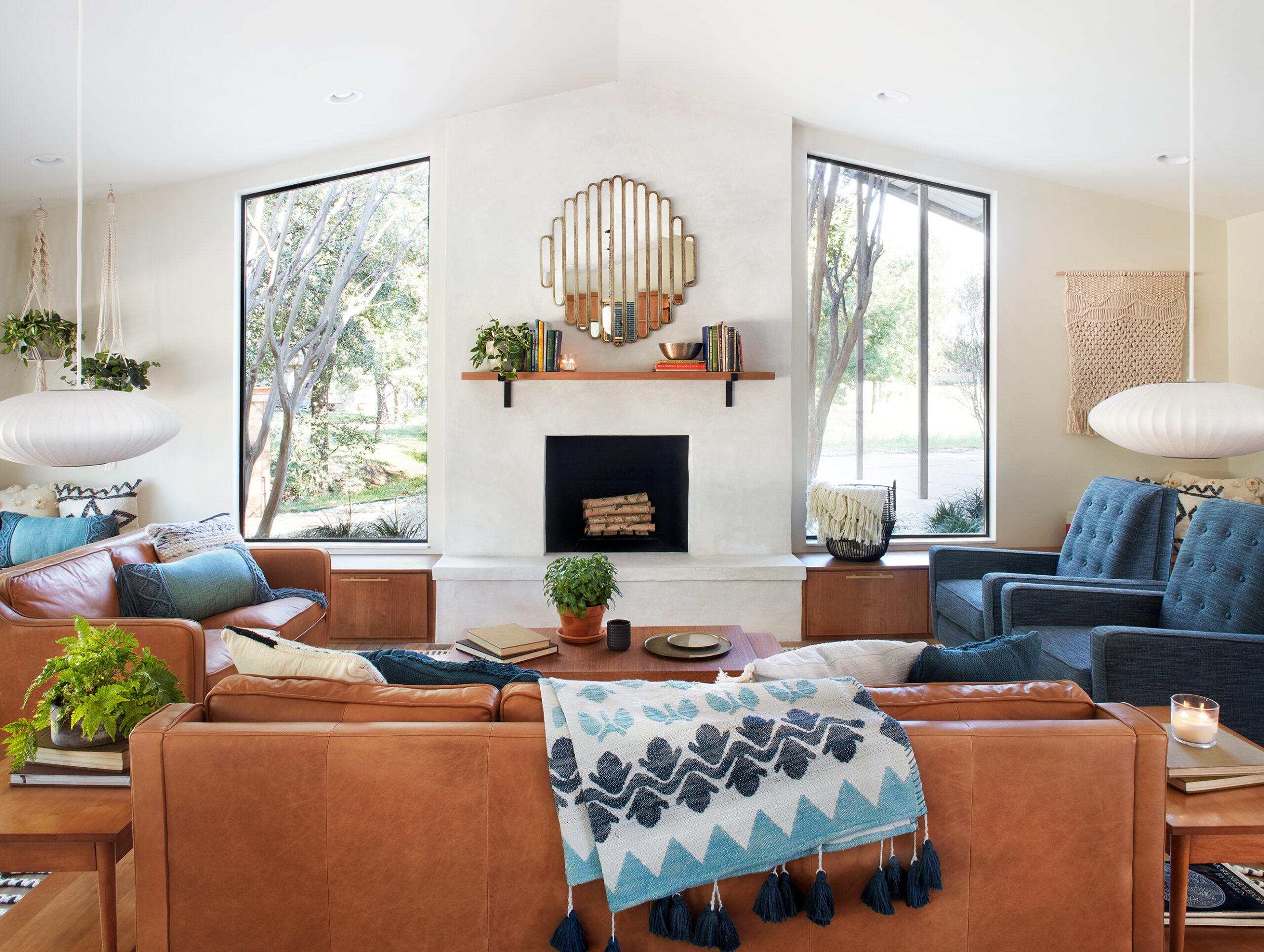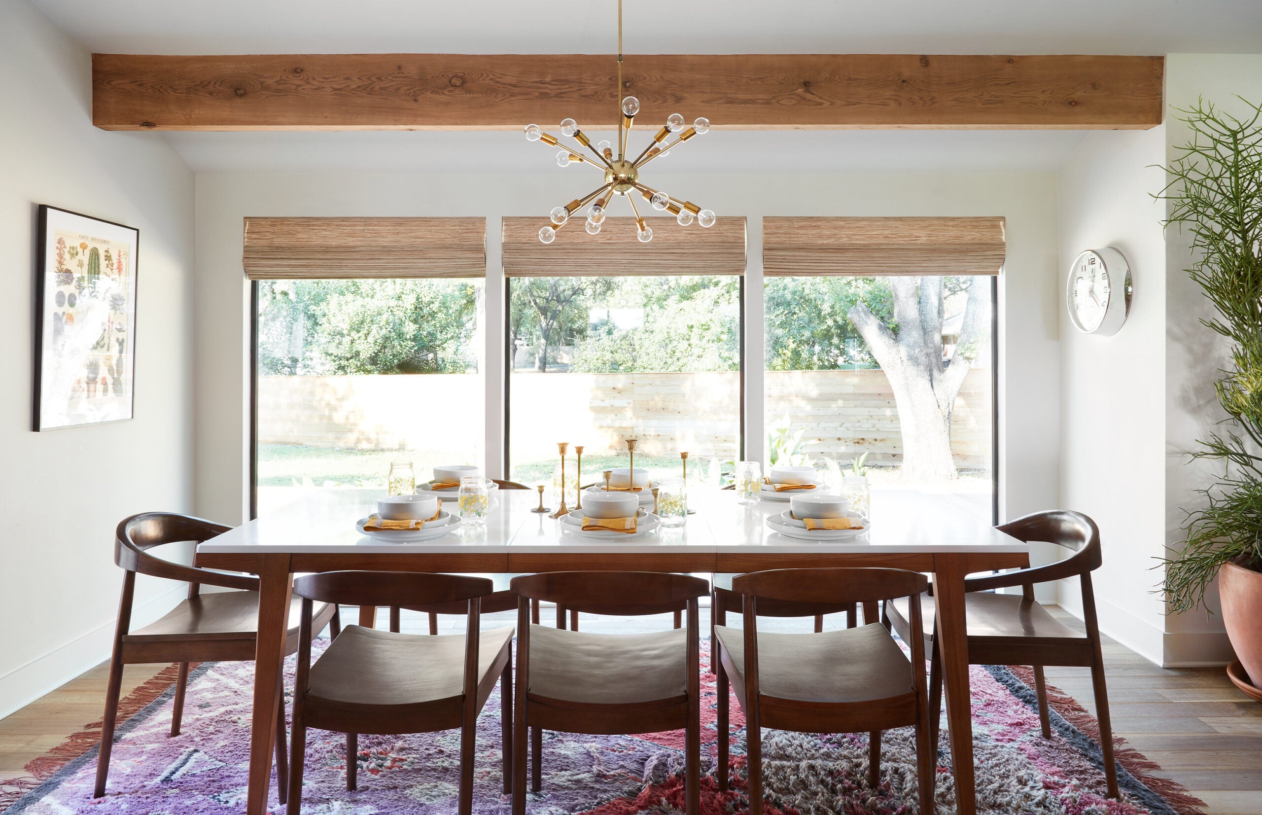
Working with my sister made this project one that I’ll never forget. Imagining her family living life inside these walls made it so fun for me. And not only was it a really memorable experience to get to work with my sis, but the end result was a vintage, mid-century modern home that I love! Overall, I’d have to say that this kitchen is my favorite room of the whole house (to be honest I had a few favorites like the living room, playroom, and master). Below are a few design tips from my sister’s kitchen.

Play with Lighting
One of the most iconic elements of the mid-century style are the light fixtures, so in this space I knew I wanted to go with some really unique ones that fit the bill. This kitchen features two different mid-century light fixtures, the pendants and the chandelier, and together they perfectly tie in that familiar, iconic look. I actually found these pendants above the island at Round Top Antiques Fair, and I bought them because they reminded me of Mikey’s fun style. The fixture over the dining room actually came from a Fixer Upper in Season Four. It was in the house before we started the renovation, and the clients didn’t love the style. It’s great that we got to repurpose it here in this house.
My advice on light fixtures is let them play up a specific style you are trying to achieve. I always think of lighting as a way to adorn a specific space, think of it as the finishing touch. If you find antique fixtures that you love, contact a local electrician and they can rewire them for your renovation. Light fixtures create a perfect opportunity to express your design style, so have fun choosing them for your home.
Be Creative with Shelving
The biggest challenge with this kitchen was the large wall in the entry that closed off the foyer from the rest of the house. Because of the budget, we couldn’t relocate the kitchen and we wanted to try and keep the appliances and plumbing in their existing spots. I had no choice but to work with the wall, so I designed a metal/glass wall that our friend, Dustin, helped construct. The great thing about Dustin is he loves a creative challenge. I didn’t just want a large window with no practical purpose, so I asked Dustin to add metal shelves on the window so my sister could store everyday basics as well as cookbooks and of course her favorite, plants! I also wanted to create a simple shelf next to the refrigerator that could serve as a coffee bar.
Think outside the box when it comes to everyday shelving. There are also many ways you can create custom shelving by mixing materials - wood with metal, metal with glass, etc. Open shelving adds personality to a kitchen, get creative and find a way to incorporate them even if it’s in a smaller spot like this coffee nook.
Don't Be Afraid of Color
While I will always be a fan of classic black and white, I love playing with color in unexpected places, like in tile and wallpaper. This teal (my sister’s favorite color) colored tile backsplash was striking and perfect for the style of this home, and, when mixed with the warm wood cabinetry and classic white countertops, it wasn’t “too bold.” This is a good size kitchen that didn’t require a lot of square footage for the backsplash, so I really wanted to make it count by choosing a fun color and cool patterned tile. If you aren’t ready to commit to a color for the backsplash, consider painting your island a great color or paint your lower cabinets. If this still feels a bit scary, incorporate color with your dishware or simply splurge on some really cute tea towels!

Think About Creative Solutions
I happen to know that my sister has an impressive cookbook collection, so I had these open shelves built on the end of her island to store them. This works well, because it serves as a little bookshelf, and she (or her kids, who love to help) can very easily thumb through them to find her favorites. It’s even better because it keeps them on display and close by, rather than storing them in a pantry or a storage closet where she has to go dig them out. If you’re renovating, really think about what kinds of additions, like this one, would work well for you, your family, and your lifestyle. Get creative!
Incorporating Green
My sister is the original plant lady. In fact, she designed the plant lady t-shirt from Magnolia Market herself. So the fact that this home had skylights and lots of windows made it all the more perfect for her plant babies. I’m huge on tying some green into your space, especially on open shelving units. My advice is to put the more low maintenance plants up high, and the ones that require more love within reach. And if you think you have a black thumb, try the Hoya plant. This one looks so pretty growing over the side of a shelf and is fairly easy to care for. Ask your local nursery employees how to care for it and if it would work in your space. Bring a photo of the area you have in mind for it and they can help you keep it happy.
Thanks for watching tonight’s very special Fixer Upper episode! Here's a peek at more photos and details from The Safe Gamble House!


