
Rachel and Luke Whyte, were the kind of clients Chip and I love to work with: creative, adventurous, and ready to try new things. The Chip 2.0 house was definitely stuck in the nineties. Its dated tile, wallpaper, and carpet were among the list of things that the Whytes were concerned with. They have a more casual and practical style and didn’t know if this house could ever feel like their style and home.


The Whytes have a modern-traditional style, so, with this in mind, we went with neutral paint colors and clean and simple wainscoting.


With a one-year-old and another baby on the way, we decided to install this inviting and durable laminate flooring throughout the home.

The vision for this living room was for it be a cozy and comfortable retreat designed with Luke in mind. Luke is a true outdoors guy and loves the mountains, so I thought this stone fireplace, custom cedar mantel, and gray built-ins wood be just masculine enough of a space for him to feel at home.


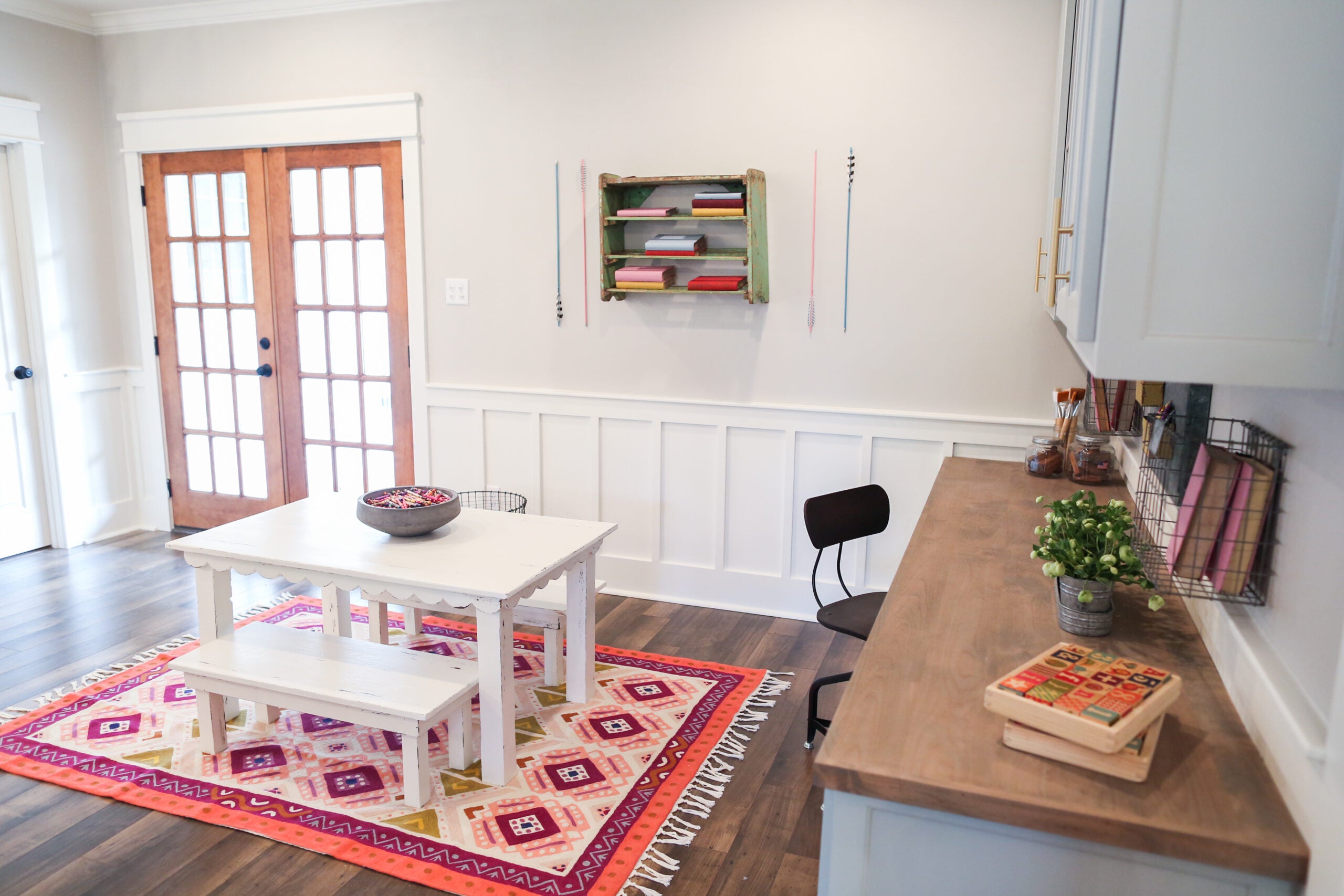
The Whytes' one-year-old daughter is just like her dad in her love of exploration. I knew she would need an intentional space to play and explore, away from the staircase, so we worked in a colorful play room right next to the kitchen for her to draw and create.

Rachel also runs her own photography studio and works from home a lot, so the desk area here will also serve as a practical place for Rachel to work close by while her children are playing.
My friend and carpenter, Clint Harp, built this little table that I designed for her playroom. This table may be one of my top five favorite tables Clint has ever built for us! Its tiny scalloped details were the sweetest little addition and completely finished off this space.

As usual, this kitchen was one of my favorite spaces in the Whytes' home—rivaled only by their master bathroom—but we’ll get to that soon.


The original kitchen was dated and completely gutted on #demoday. We also took down the wall separating the dining room from the kitchen to keep it more open and less formal.


I incorporated the modern traditional feel throughout the kitchen to keep with Rachel’s style preferences. We went with marble countertops, white tile backsplash, and this blue-gray color for the cabinets and vent hood. To break up the light colors, I added these wooden pendants and incorporated some unexpected and fun brushed brass hardware and pulls.

This kitchen island added extra storage, enough space for their requested apron sink and kitchen appliances. Plus, it offered a small eat-in space for the Whytes to have breakfast together before they head off to work in the mornings.

The Whytes' dining room was a simple extension of the kitchen after we took the wall out. The natural light in this space made it airy and perfectly aligned with what I knew Rachel would love.

The existing outdated stair railings had to go, and, to break up the light paint colors, we went with these modern-style iron railings I designed and replaced the carpet with the same laminate flooring. This simple update made all the difference and made the home feel more unique rather than cookie cutter.

In the master bedroom we found even more dated wallpaper and pink carpet. It was a great size master, and all of its updates were purely cosmetic. It’s amazing what a few recessed lights, a fresh chandelier, and a coat of paint can do for a room.
I found this old cathedral window frame and knew it would make the perfect unexpected headboard for the Whytes' master suite. My favorite part about design is when I get the opportunity to use unique pieces as a substitute for common ones, such as a headboard.


Finally, we can talk about my favorite space in this house: the Whytes' master bathroom. This bathroom was originally the biggest eyesore in the whole home, but its bones I could definitely work with.

The bathroom carpet, dated cabinetry, fixtures, and brass hardware were all replaced to match the rest of the renovation. We went with the same marble countertops from the kitchen, white cabinetry, and a free standing tub and a shower.

The modern open shelving unit above the tub, along with raw wooden mirror frames, breaks up the traditional white and really warmed the space. The best part of this room was the balcony overlooking their backyard.

The exterior of the Whyte home received quite the overhaul. We painted the brick a fresh (and appropriate) white color to match the style of the inside of their home and updated the round windows on the bottom floor from to simplify its look.

We decided to get rid of the front elevation’s balcony and replace it with this small porch overhang and metal roof. This matched the top floor’s shutters and added much-needed balance.
To warm up the cool tones we added these rich wooden french doors in place of the outdated original front door, and simple landscaping to keep the attention on their beautiful shade tree.

Thank you, Whyte family, for trusting us with your beautiful home! We hope you are happy raising your sweet family in your new neighborhood for many years to come.
Photos by Rachel Whyte
